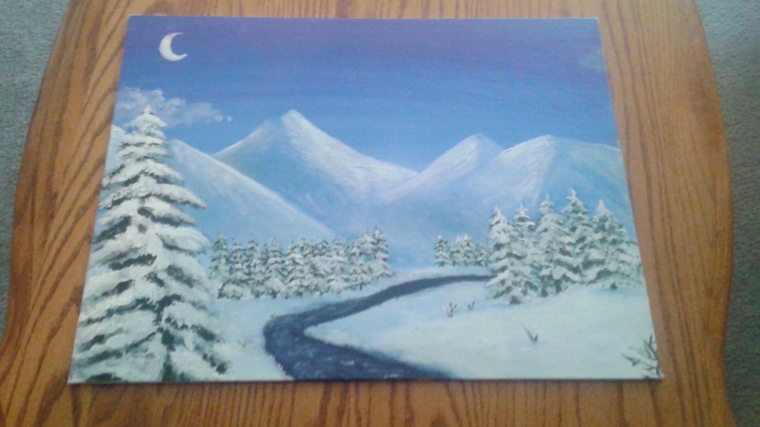
 This is my third painting. It is a snowy landscape. I really enjoyed painting this one. Since it was all pretty much blue-based, I had a lot of fun creating values with the different shades of blue. The only other colors I used were black and green for the trees, and also a little for the brown sticks in the ground. It was really interesting to see how different shades of the same color could create so much variety and depth. It was a little difficult to do the trees, but I went for it anyways, and they started to improve. Overall, I was very pleased with the final product.
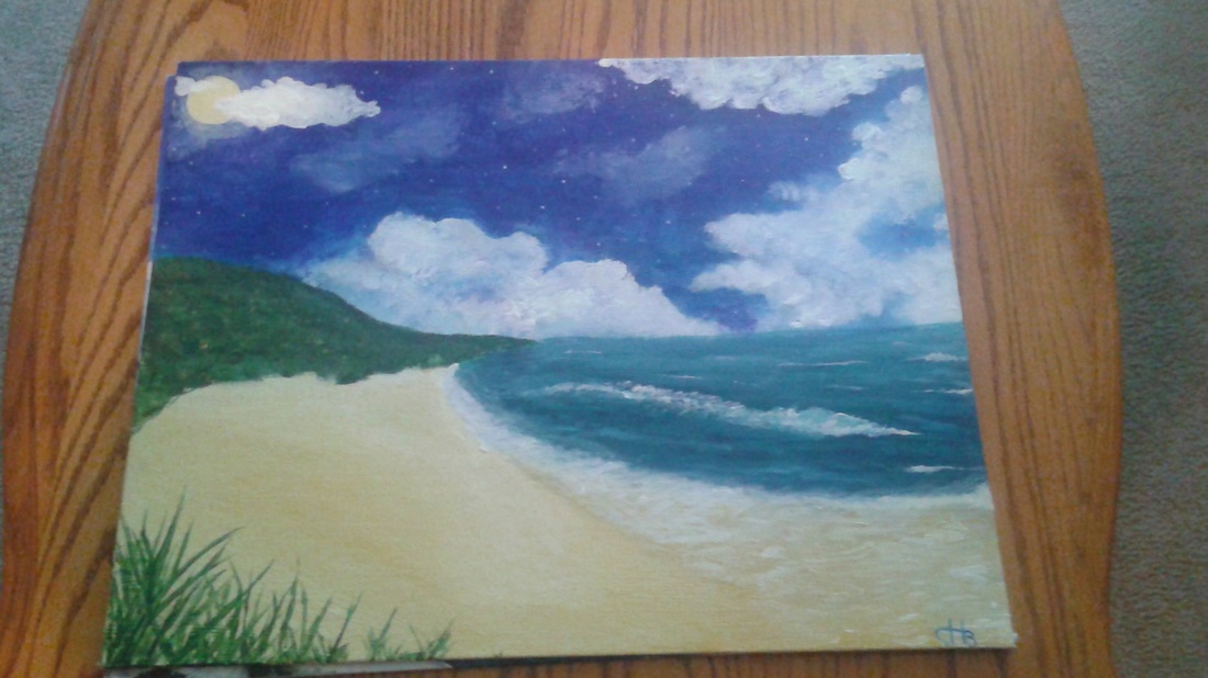 This is my second choice painting. It is based off a Photo shopped picture that was a daytime beach with a night sky. Painting is my favorite thing to do in art, so I was happy to have several opportunities to try at this skill. For this painting, I used texture for the grass, value for the sand, and contrast for the sky and land. It was very difficult to do the tide at the end of the beach. I tried to capture the translucent water, which can not be easily painted. However, with Mr. Meserve's help, I was able to come fairly close. I also added the grass in the foreground to show depth. The sky was the easiest part, because I had practiced it a lot before. Overall, I was fairly pleased with the product.
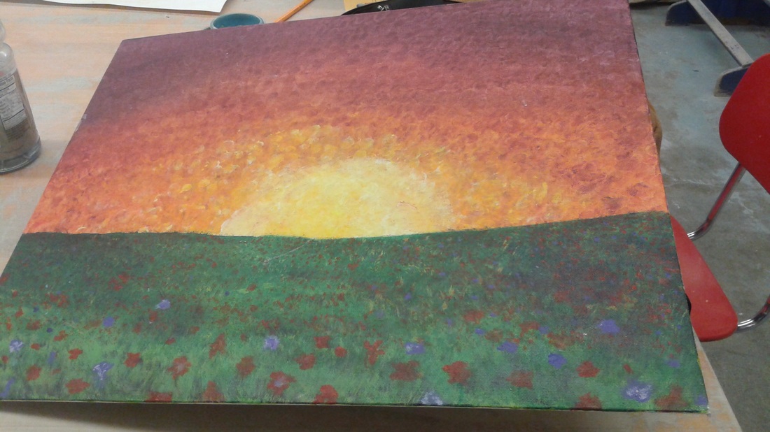 This is one of my choice paintings. It is not one of my favorites. I tried out finger-painting for the sky. Then i used a flat brush to texture the grass. Mr. Meserve wanted me to add some wildflowers, so I did. That helped bring out the look of a field, rather then make it look like a grassy rectangle. I used the new skills of finger-painting. The I used blending, value, and color to create the look of a landscape. It was difficult to bring it to life, but it was fun to go crazy with it.
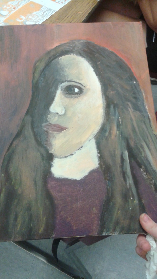 This is my self portrait painting. It looks awful in many ways. It has a lot of problems with it. However, i worked hard and im pretty sire there's like 20 layers of paint by the end. It has the art elements of value and shape to create a 3D looking shape. I tried to use color to add some human like appearence. However, it turned out to look like a zombie. Overall the most difficult part was creating value and shape. The easiest part was blending colors.
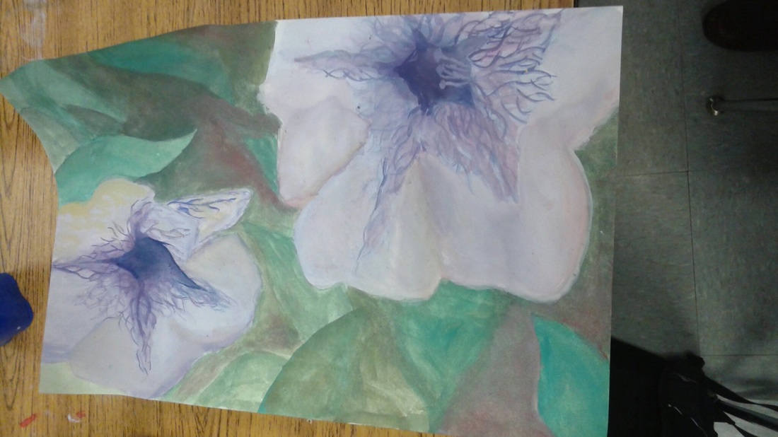 This is my final Macro painting. It is two purple flowers with a background of leaves. I used the new skill if painting with water based paints. This was difficult for me because the paper started ripping, and it was more difficult to blend the colors. I used the art ekemebts if contrast, by putting a touch of red in the green, and a little yellow in the purple. Overall, the effect made the colors pop more.
This is my two point perspective project. It is the stairway of the Mt.Si Hallway. The most difficult part was the stairs. My vanishing points were in reality way off my page, so it was difficult to make the lines accurate. i used the art elements of lines, and perspective to create this project. By doing this, it looked more realistic. It also added depth. I liked the way it came out for the most part. 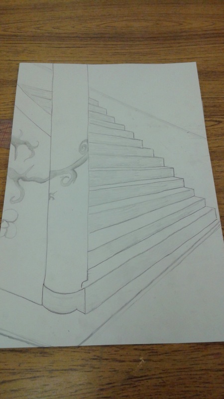 This is my motion project. It is a swirly pattern, with a more linear background. It uses the elements of motion and pattern to create a consistent set of shapes that appear to be moving. It also required the art skills of lines and design. The uardest part was coming up with an idea. The easiest part was putting that idea down on paper. The black sharpie added a lot of boldness. Together everything created a unique design. 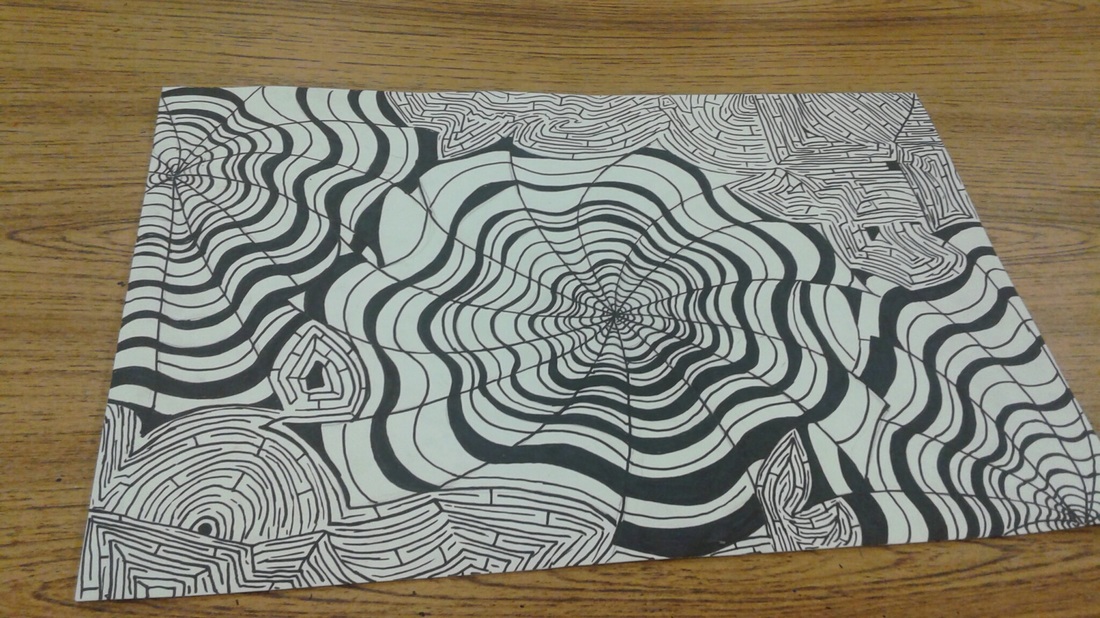 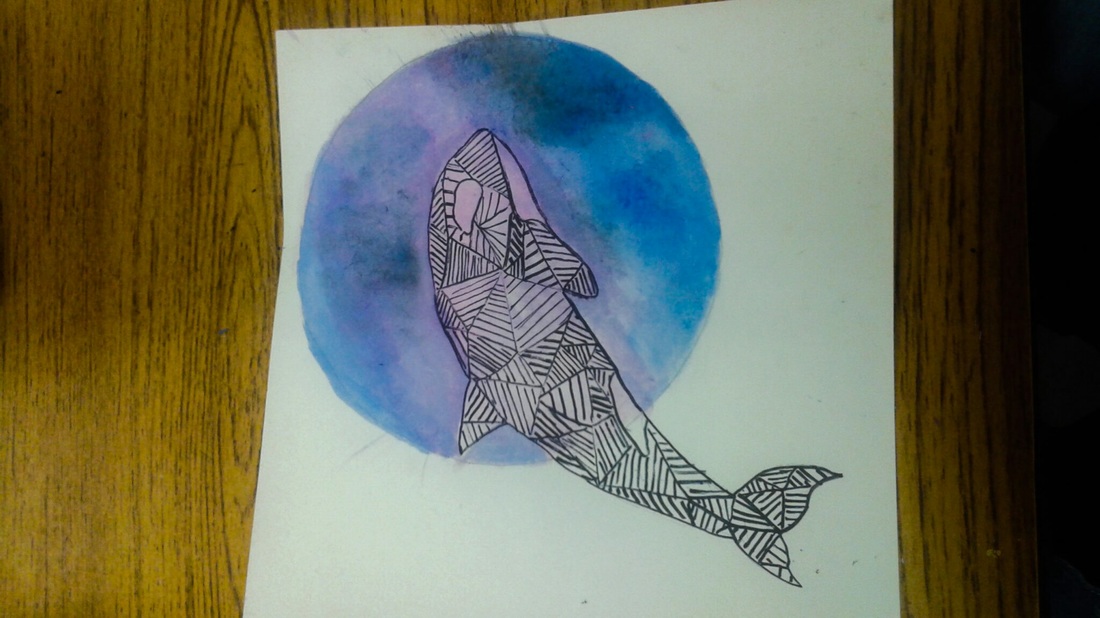 This is my spirit animal. It is an orca whale. It chose me, because it is somewhat mysterious, yet enjoys its freedom (like me ). It is a orca, with a background of a moon that is blue and purple. I used the art elements of shape, pattern, and design to create the inside of the orca whale. I also used the new skills of watercolor painting. The hardest part was painting the moon becuase i was so used to acrylic. The easiest part was the outline of the whale.These things came together to make a artistic, abstract kind of picture.
|
 RSS Feed
